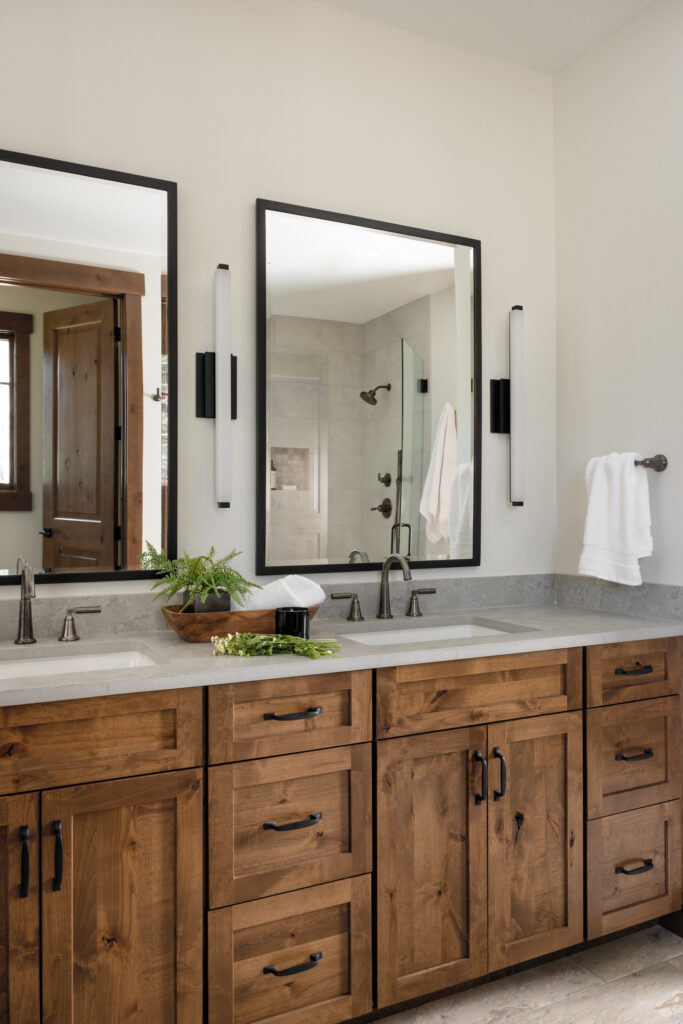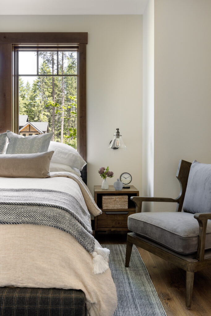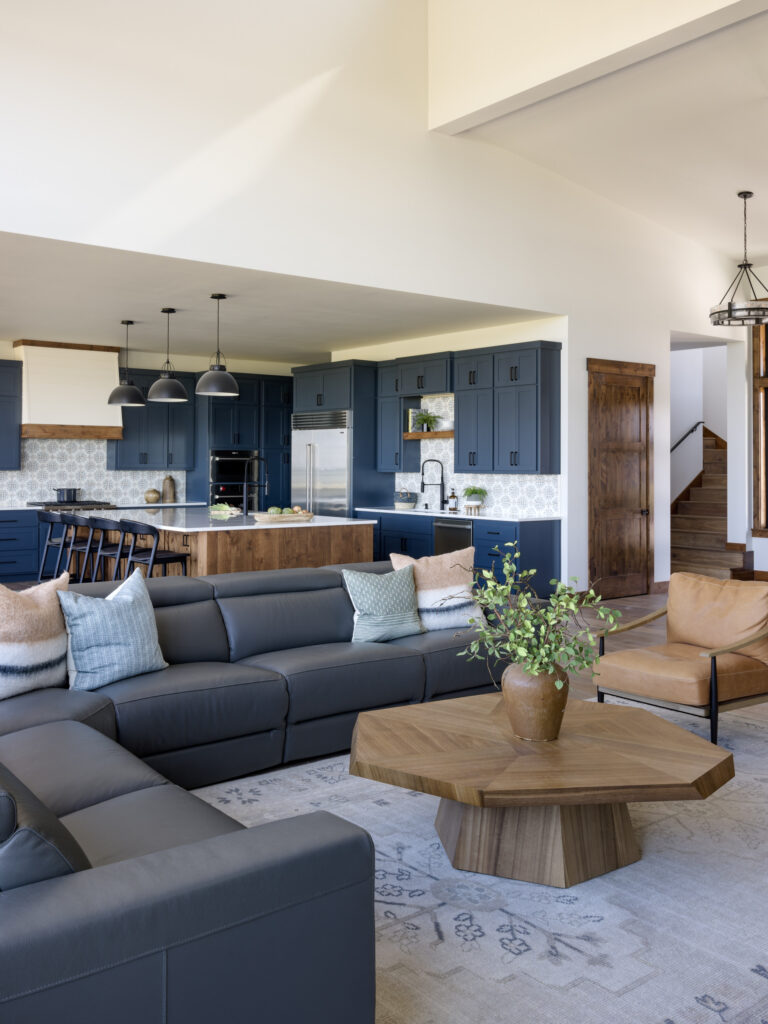
Choosing a paint color seems easy—until you’ve painted an entire room and suddenly realize it looks more like baby blue than the moody gray you envisioned.
Paint can completely transform a space, but only if you get it right. As designers, we’ve seen our fair share of paint color mishaps—and we’re here to help you avoid them. Whether you’re refreshing a single wall or revamping your entire home, here are six common paint mistakes to stop making (plus a few go-to colors we love right now!).
1. Ignoring the Undertones
Not all whites are created equal. In fact, every paint color has an undertone—whether it’s blue, pink, green, or even purple. And if you don’t pay attention, you might end up with walls that clash with everything else in the room.
Designer tip: Always compare your paint swatches to your floors, countertops, and fixed elements. That soft “greige” might suddenly look lavender next to warm wood tones.
Try this instead:
- Benjamin Moore “Classic Gray” – a warm, barely-there greige that plays nice with most palettes.
- Sherwin-Williams “Agreeable Gray” – a tried-and-true neutral with a cozy undertone.
2. Choosing the Wrong Finish
Glossy kitchen walls? Flat paint in a high-traffic hallway? Nope. The finish (also called sheen) affects both the look and durability of your paint job.
Designer tip:
- Use matte or eggshell for living spaces and bedrooms (low sheen, hides imperfections).
- Use satin or semi-gloss for kitchens, bathrooms, and trim (easy to wipe clean).
- Avoid high-gloss unless you’re going for a bold, intentional statement—it’s tricky to pull off.
3. Skipping the Sample Test
That little paint chip at the store? It’s not enough. Colors look completely different in your home depending on the lighting and surrounding finishes. Always sample your top 2–3 paint choices on multiple walls, and check them at different times of day. Natural light, artificial light, and shadows all play a huge role.
4. Being Too Trend-Driven
We love a good color trend as much as anyone, but designing solely based on what’s “in” can leave you with a home that feels dated fast. Choose timeless neutrals or colors that you truly love, and bring trends in through accents like pillows and art, or let the millwork do the talking with a deep contrast.
5. Painting Every Room the Same Color
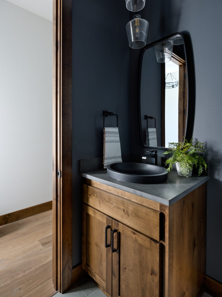
It’s tempting to pick one safe neutral and roll it throughout your whole house—but that can end up feeling flat and lifeless. Think of your home as a story with chapters. Keep the colors cohesive, but have a room or two have its own personality with subtle variations in tone or depth. The best place to do this is in a powder room, or even in the kids bedroom for a personal touch.
6. Forgetting the Ceiling
The ceiling is your fifth wall—and painting it a default bright white isn’t always the best move.
Designer tip:
- For a cozy, cocoon-like feel, paint the ceiling the same color as the walls (especially in small rooms or powder baths).
- For a modern, seamless look, try a soft off-white with a matte finish that blends with your trim.
One of our favorite ceiling/wall color shades is Sherwin Williams “Moderne White” – subtle and soft without being stark.
Kindly,
Michelle


