2025 Colors of the Year Trends: Rich Jewel Tones & Luxe Neutrals Take Center Stage
As we step into 2025, the world of interior design is embracing a new era of elegance, warmth, and sophistication. The 2025 paint colors of the year from top brands like Pantone, Benjamin Moore, Dunn-Edwards, Behr, and Sherwin Williams offer a striking blend of muted jewel tones, rich browns, and luxe neutrals. These colors evoke a sense of comfort, moodiness, and refined beauty, inviting us to create spaces that feel both timeless and deeply personal.
Let’s dive into the individual colors and explore how this year’s trend can transform your home.
Pantone’s Mocha Mousse: A Warm, Earthy Embrace
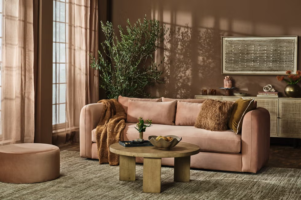
Pantone’s 2025 Color of the Year, Mocha Mousse, is a deep, velvety brown with hints of rich cocoa and coffee undertones. This sophisticated hue encapsulates the feeling of cozy indulgence and invites a grounded, yet luxurious, atmosphere into any space.
Mocha Mousse’s warmth provides an enveloping feeling that can balance out a room’s energy. It pairs beautifully with metallic accents, rich wood tones, and other earthy hues, creating a calm, nurturing environment. This color’s versatile richness makes it ideal for living rooms, dining areas, and bedrooms, where you want to add depth without overwhelming the senses.
Benjamin Moore’s Cinnamon Slate: A Toast to Spicy Elegance
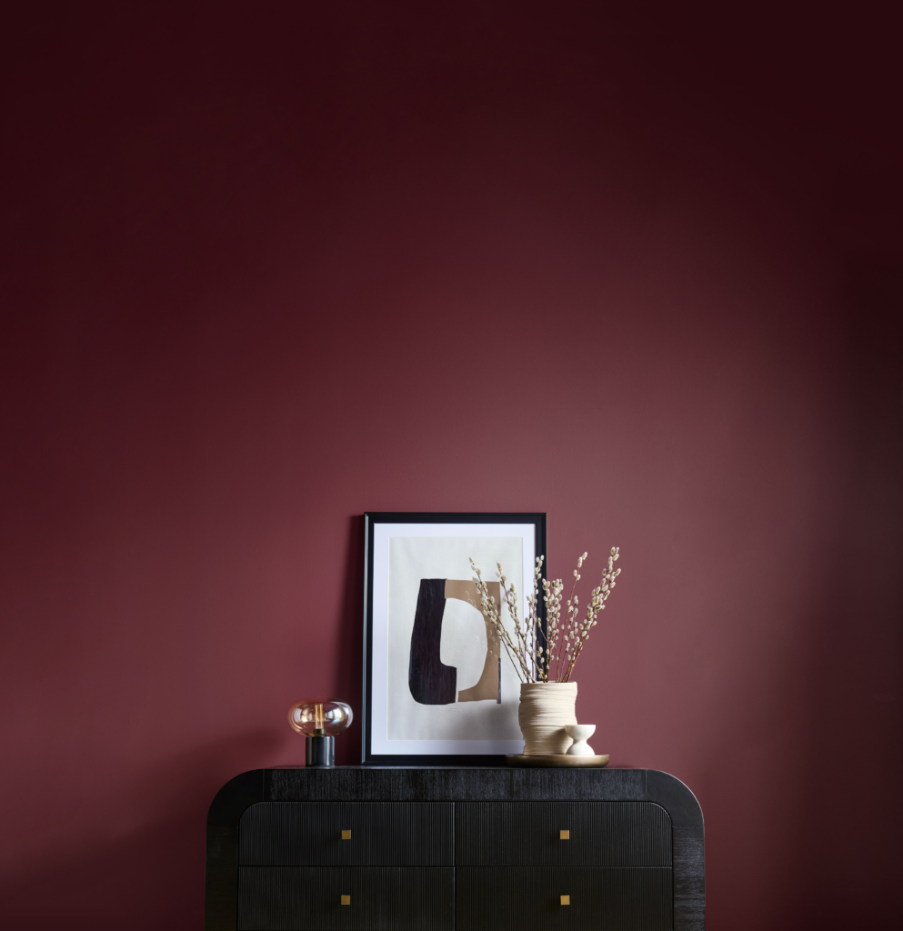
Benjamin Moore has chosen Cinnamon Slate as their 2025 Color of the Year—a warm, muted reddish-brown that combines the earthy depth of terracotta with a sophisticated slate undertone. It’s a perfect color for those seeking warmth and personality without veering into anything too bold.
Cinnamon Slate offers a beautifully subtle energy to a space, particularly when paired with lighter accents or neutral tones. It works wonders in kitchens, entryways, and even home offices, where it can add a layer of cozy elegance to everyday spaces. The muted spice of this color evokes feelings of both vintage charm and modern luxury, making it ideal for anyone looking to create a timeless yet inviting atmosphere.
Dunn-Edwards’ Caramelized: Sweet, But Never Overbearing
Dunn-Edwards introduces Caramelized, a soft golden-brown that feels like the perfect blend of sweet and savory. This luxurious neutral provides a sense of warmth and depth without becoming overpowering, making it perfect for creating serene and balanced spaces.
This color embodies the trend of “luxe neutrals,” which are both rich in tone and easy to live with. Caramelized has a soft, buttery quality that pairs effortlessly with other muted tones like sage, soft taupe, or even darker browns like Mocha Mousse. Use it in bedrooms, living rooms, or accent walls to bring warmth and refinement without the harshness of more traditional bold colors.
Behr’s Rumors: Subtle Drama in a Mocha-Rose Blend
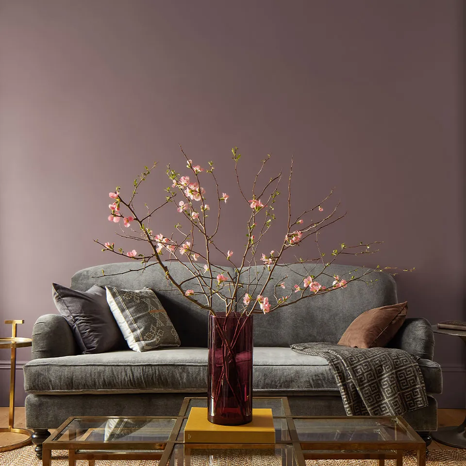
Behr’s 2025 Color of the Year, Rumors, is a muted, dusky pink with a brownish undertone. This color strikes the perfect balance between romance and drama, offering a tone that’s subtle yet full of depth. It brings to mind the mysterious richness of a well-aged rosewood or a darkened blush—perfect for creating a sense of intimacy and elegance.
Rumors can be used to enhance living areas, powder rooms, or even accent walls. Pair it with softer tones like deep plum, navy, or muted gold to create a sophisticated, moody ambiance. The richness of this color makes it feel both contemporary and timeless, offering a soft counterpoint to harsher, more saturated colors often seen in interior design trends.
Sherwin-Williams’ Color Capsule of the Year: A Moody Palette of Luxe Neutrals and Jewel Tones
Sherwin-Williams has chosen a “Color Capsule of the Year” for 2025 instead of a single hue, offering a curated palette of muted jewel tones, warm browns, and cool neutrals. This ensemble of colors blends the luxuriousness of gemstones with the grounded elegance of earth tones.
The mood of this palette is decidedly moody and introspective, but with a touch of refined luxury. Think teal blues, smoky purples, and forest greens balanced by rich browns and taupes. These colors are perfect for creating spaces that feel deeply inviting yet sophisticated, such as home libraries, intimate lounges, or dining rooms.
A color like teal blue (rich but understated) combined with deep brown or charcoal gray offers a dramatic but cozy effect. Muted purples and greens paired with soft neutrals will bring a sense of depth without overwhelming the space, making it ideal for bedrooms or study rooms.
See other Colors of the Year Here!
Why These Colors Matter: A Return to Subtlety, Depth, and Luxury
The 2025 color trends reflect a larger societal shift toward valuing subtlety over showiness. After a few years of bright, bold, and high-energy color choices, these muted jewel tones and luxe neutrals seem like a natural evolution. We are moving away from extremes and leaning into hues that feel grounded, intentional, and timeless.
This year’s palette is about creating spaces that are both calming and luxurious. The warm browns, soft metallics, and deep jewel tones are perfect for evoking feelings of comfort and relaxation while still maintaining a high level of sophistication. These colors work across all types of interiors, from modern urban apartments to country homes, and they’re perfect for anyone looking to create a sanctuary with subtle drama and refined beauty.
How to Style These Colors in Your Home
To make the most of the 2025 color trend in your own spaces, here are a few styling tips:
- Layer Textures: Pair these rich colors with textures like velvet, linen, and wool to bring a tactile element to your space. The combination of soft fabrics and deep hues creates a welcoming, comfortable environment.
- Add Metallic Accents: Warm metallics like gold, brass, and copper can enhance the luxe feeling of the colors. Think gold-framed mirrors, brass lighting fixtures, or copper vases.
- Mix with Natural Elements: Incorporate natural materials such as wood, stone, or leather to balance the richness of these tones and bring in a sense of earthiness.
- Use Accent Walls: These colors can make stunning accent walls in living rooms, bedrooms, or entryways. If you’re hesitant about committing to an entire room in a deep shade, start with a feature wall to bring in the trend.
- Play with Light and Shadow: The moody nature of these colors works particularly well in rooms with plenty of natural light. If your space is on the darker side, consider pairing these hues with light-colored furniture or strategically placed lighting to keep the room feeling airy.
Final Thoughts
The 2025 color palette is all about bringing warmth, comfort, and luxury into our homes. Whether you gravitate towards Pantone’s Mocha Mousse, Benjamin Moore’s Cinnamon Slate, or the moody hues from Sherwin-Williams, these colors promise to create spaces that feel like a retreat from the world—warm, welcoming, and undeniably stylish. So, go ahead and embrace the rich browns, muted jewel tones, and luxe neutrals of 2025. They’re ready to turn your home into a sophisticated sanctuary for the years to come.
Kindly,
Michelle
